Personiv
The “Cool Kids” Rebrand
As their brand naturally evolved over time, Personiv found itself leaning into bolder design concepts such as collaged images and patterns. After discussing what the client ideally wanted, it came out that they wanted to be the "cool kids" of outsourced accounting and trusted me to tackle the rebrand.
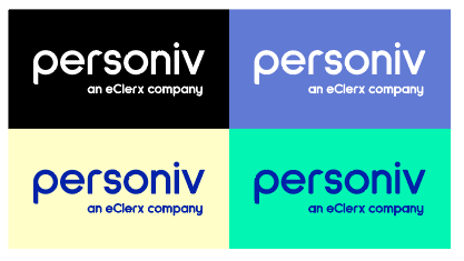
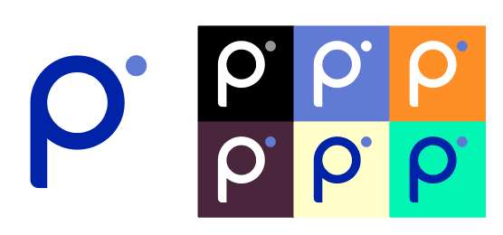
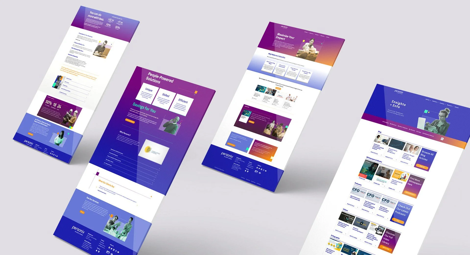
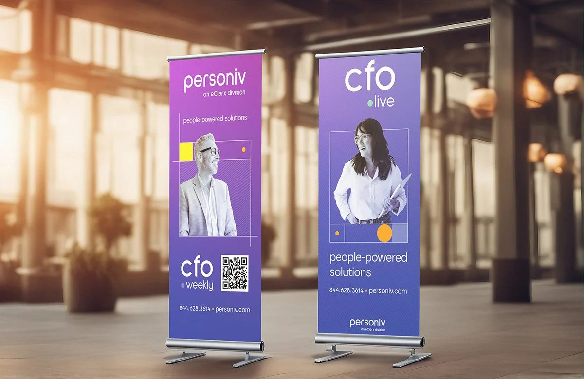
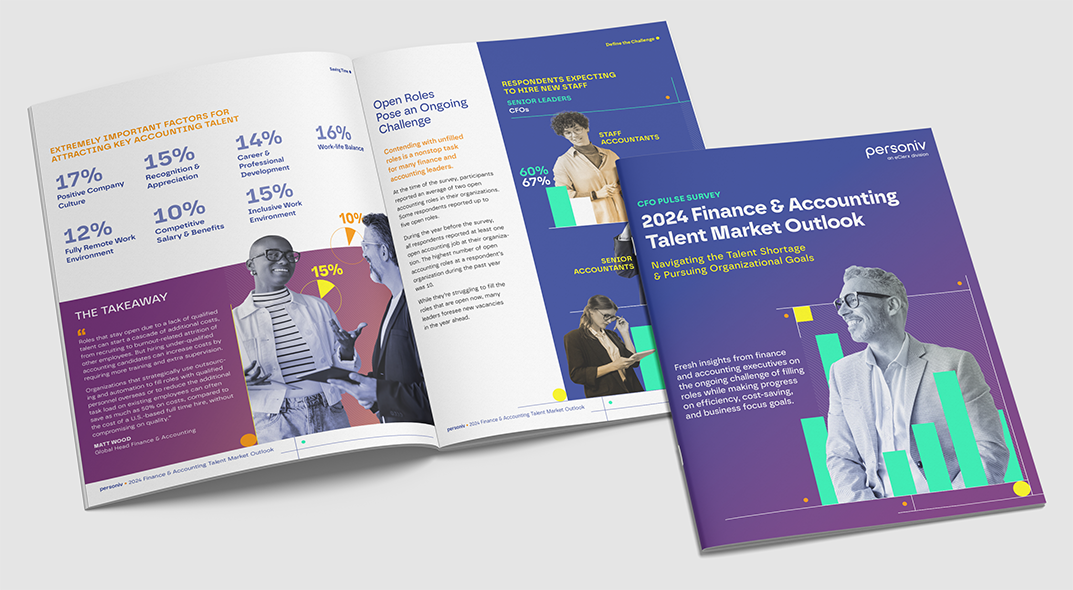
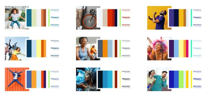
With an eye on social media and digital ads, we pushed the colors outside of a traditional print palette. Bright colors, overlapping patterns, bring a unique and fresh brand of a company with its eyes on the future.
Process
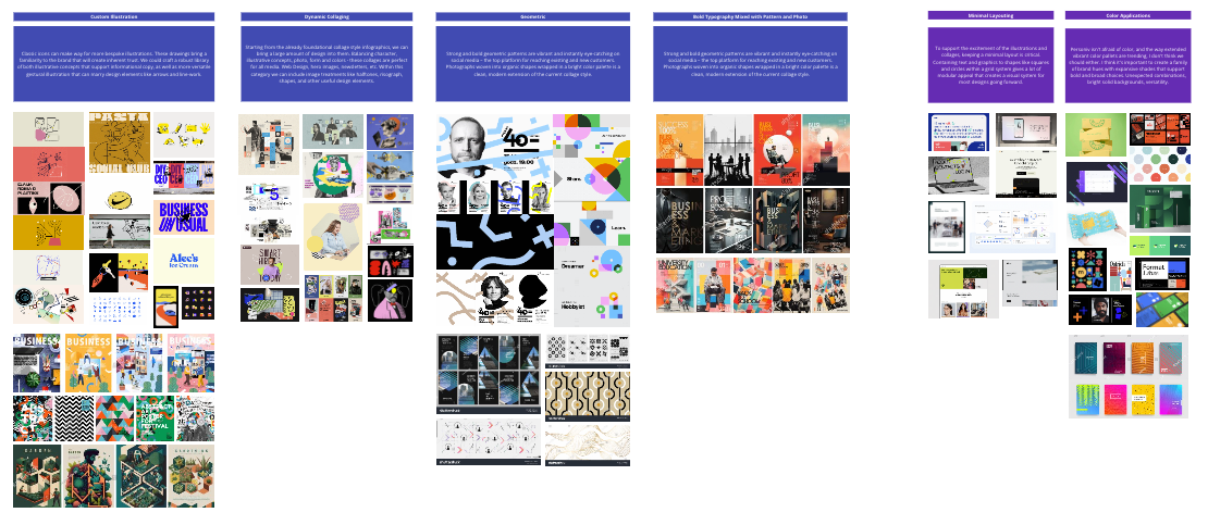
Rebranding Personiv began with an in-depth discussion of their previous style to determine what was or wasn't working. We followed with moodboards exploring what "the cool kids of accounting" could look like and set the company apart from their competitors.
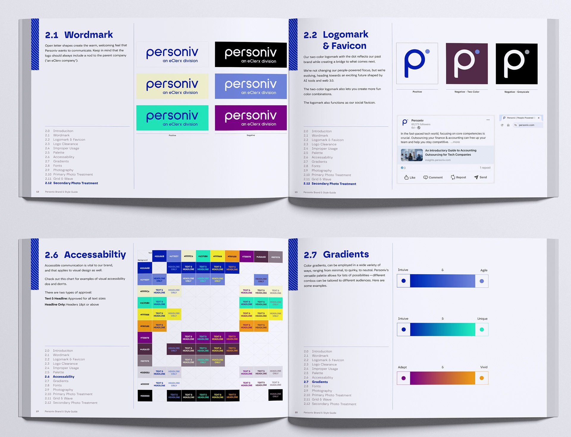
New color palettes focused heavily on RGB colors to shine in digital platforms with secondary colors for CMYK projects.
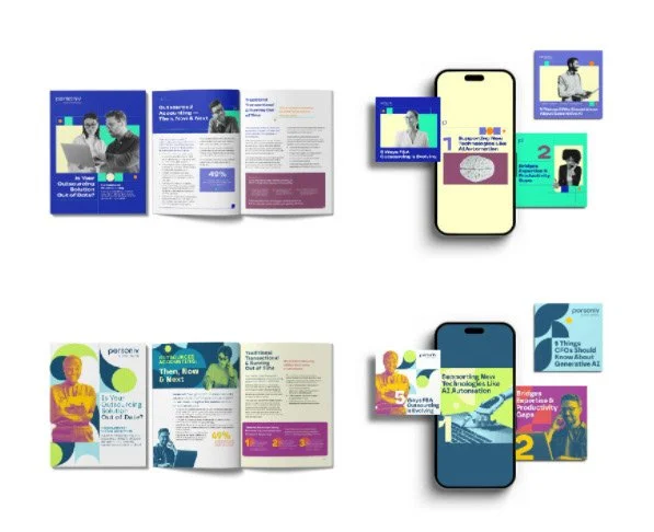
In the end, we proposed two new looks to Personiv's management team.

Deliverables
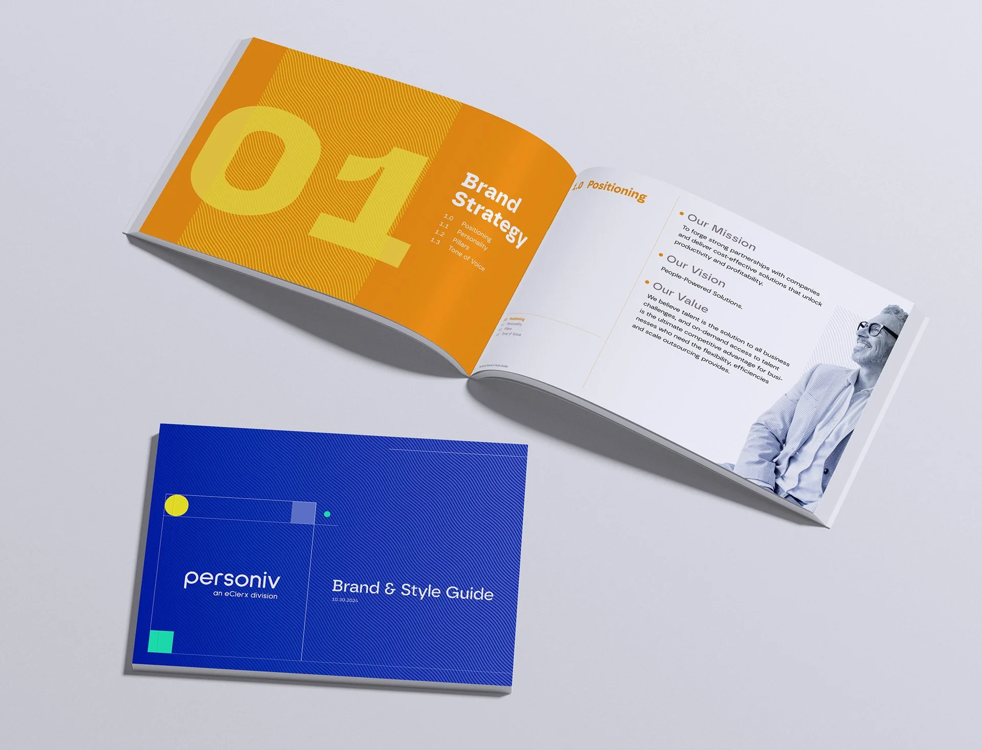
Brand guidelines, Logo Suite, Original Icons, Website Overhaul, Collateral, and Social Ads
Team: Myself, Ashton Nguyen, and George Mott
Timeframe: Three Month